
User friendly Spa Website. “Don’t make me think!”
A recent -and poor- web experience is the reason for today’s post about the user friendly spa website:
I looked up flights between Salzburg and Cologne, two rather small, local airports. It took me a short while to figure out which airlines served the two points.
I eventually ended up with 3 airlines that had direct flights and I tried to compare their schedules.
I would have never thought how tedious a task that could be!
Especially as one airline had a very user UNfriendly website, which made me put back in all my info over again every time I tried to modify my search, for example by date. Eventually and highly frustrated, I ruled this very airline out, simply for their user unfriendly site. I ended up picking my flights between the two remaining ones that had much better usability.
Competition is only one click away
Lesson learned: On the internet, competition is only one click away. If you confuse the user of your site, or annoy them, or frustrate them, they will leave and likely not come back.
What is even worse? You don’t even know that they left since they never complained. But a customer complaint is a gift to the company.
Actually, we are talking about complaint management here, so click, if you would like to go deeper into that topic.
Steve Krug: Don’t Make Me Think
My flight search and booking endeavour brought back the memory of a book by Steve Krug called ‘Don’t make me think’. A common sense approach to web usability.
Steve Krug’s general idea is:
‘If you asked “What’s the most important thing I should do if I
want to make sure my Web site is easy to use?”
The answer is simple. It’s not “Nothing important should ever be more than two clicks away,” or “Speak the user’s language,” or even “Be consistent.” ‘
In February I had already published my article Spa online booking: Is the print spa menu outdated? where I am talking about real time online booking for spa treatments and the advantages for the guest, such as
- fast and easy booking with instant confirmation
- lots of additional information available
- global accessibility and more.
But: no system will work for the user if not easy to use.
I Remember…
When working as Spa Manager a long time ago, I was to organise a spa visit for a group of busy London based CEOs.
I was personally in touch with their assistants in order to confirm treatments and times, and remember one conversation vividly. I had sent an email to one of the assistants with our spa menu, thus offering the CEO himself or his assistant to pick a desired treatment. As the deadline approached and I hadn’t had their answer still, I inquired and offered to make a suggestion for a suitable treatment. To which the assistant said: “oh, yes please, please suggest something, make it easy on us.” Don’t make them think…
Understand your customer
Consumer Behaviour is pretty unpredictable even for experts. Most of the time. However every spa business needs to understand their consumer’s behaviour.
Who buys, pays, and uses?
Where do they buy, pay, and use?
How do they buy, pay, and use?
The underlying question to consumer behaviour is: Why and How do people consume. After all, consumers hold all the power in the business world, they basically hire & fire (not literally, but are the reason for). Understanding the WHY and HOW is crucial for formulating a successful spa marketing plan.

User Friendly Spa Website Check
Successful marketing starts with successful communication through a user friendly spa website:
DO
… provide all important information such as contact details where people look first
… KISS – keep it super simple
… be always truthful
… think about Search Engine Optimisation
… invest in clever web design
… think about spa online booking
… focus on what is important to your target customer
… update information regularly, nothing is worse than outdated info: I recently came across a spa website with an information on xmas and new years eve opening times for 2015/16. In October.
… keep it logical
… make click buttons look like they can be clicked obviously
… be trustworthy
Don’t
… ‘make me think’
… make me look for important information more than two clicks away
… lie or hide
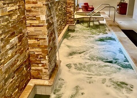
… bore me with millions of standardised pictures (my all time ‘favourite’ is the-hot-stones-aligned-on-the-back image)
… confuse me with too many promotions and commercials
… be imprecise
… waste my time with cleverly fabricated sales texts and common phrases such as “…. relax in our beautiful facilities… Every Spa says that. Every Spa has that.
… force users to work around your system, make your system work around your customers! For example do not punish a user for not submitting their info the only way you want it, i.e. spaces or no spaces in telephone numbers. Users should be able to put their info intuitively, and not having to format them.

Oh, by the way, pre-arrival spa website checks are part of my mystery guesting service catalogue.
When was the last time you were frustrated by a user UNfriendly website?
